· Ben · craft · 6 min
Charts that cite their sources, in MDX
Three ways to add charts and diagrams to an MDX blog (SVG, Mermaid, stat callout), all rendered at build time. And one rule: no source, no figure.
Think about the last chart you put in a blog post. Not how you rendered it. Where the number came from. For most posts, the honest answer is a tab you had open in March and closed in April.
The number is probably fine. But nobody can check it, including you, and a chart is the one element on the page that readers don't check. It looks pre-verified. That's the whole reason you added it.
So this is a post about how to add charts and diagrams to an MDX blog, with a rule attached. Three kinds of figure, each rendered before the browser sees it, each carrying its own source. A figure that can't name where its number came from doesn't ship.
A figure is a claim, not decoration
Every tutorial on this subject answers one question: how do I render this thing. Install the plugin, add the fence, done. Not one of them asks whether the figure should exist or where its data came from.
That's backwards, because a chart is a load-bearing claim. Prose that says "Mermaid ships about 390 KB of JavaScript" invites a reader to squint. The same fact as a bar chart with an axis reads as measured. You borrowed credibility from the format. If you didn't do the work, you stole it.
The fix is boring and mechanical. Print the source inside the image, at build time, in the same SVG. Not in a caption underneath, which gets cropped out of the social card and disappears the moment someone screenshots the chart into Slack. Inside.
Three kinds of figure, and the intent that picks each
Most bad blog figures are the right data in the wrong shape. Pick by intent first.
A chart is for a quantity that changes across something. Time, versions, categories. If there's no axis worth labelling, it isn't a chart.
A diagram is for a flow, a state machine, an architecture. No numbers at all. If you find yourself putting a value in a box, you wanted a chart.
A stat callout is for one number that doesn't need axes to make its point. This is the option everyone skips and it's usually the correct one.
Draw the chart yourself and print the source inside it
You don't need a charting library to draw four bars. You need an array, some arithmetic, and a component that emits plain SVG at build time.
// components/BarChart.jsx
const SOURCE = "Source: sidharth.dev — Shrinking Mermaid >30%";

const data = [
  { label: "mermaid.esm.min.mjs", gzip: 392.58 },
  { label: "mermaid.min.js", gzip: 347.79 },
];

export function BarChart() {
  const max = Math.max(...data.map((d) => d.gzip));

  return (
    <svg
      viewBox="0 0 480 220"
      width="480"
      height="220"
      role="img"
      aria-labelledby="mermaid-bundle-title"
    >
      <title id="mermaid-bundle-title">
        Mermaid bundle size, gzipped: esm.min.mjs 392.58 KiB, min.js 347.79 KiB
      </title>
      {data.map((d, i) => (
        <g key={d.label} transform={`translate(0 ${i * 60 + 20})`}>
          <text x="0" y="14" className="fig-label">{d.label}</text>
          <rect x="0" y="24" height="20" width={(d.gzip / max) * 440} />
          <text x={(d.gzip / max) * 440 + 8} y="40">{d.gzip} KiB</text>
        </g>
      ))}
      <text x="0" y="210" className="fig-source">{SOURCE}</text>
    </svg>
  );
}
Two things matter here and neither is the geometry. The data is a literal in a file, so it lives in git. And SOURCE renders as a <text> node inside the SVG, so the attribution survives being screenshotted, embedded, or pasted into a deck by someone who's never read the post.
Mermaid compiles before the browser sees it
Mermaid is the right tool for a flow, and a fenced block in MDX is the right authoring surface. Write the diagram as text, keep it diffable, let a rehype plugin turn it into SVG during the build.
```mermaid
flowchart LR
  A[Crawl site] --> B[Research topics]
  B --> C{Approved?}
  C -->|yes| D[Write MDX]
  C -->|no| B
  D --> E[Open PR]
```
// astro.config.mjs
import rehypeMermaid from "rehype-mermaid";

export default defineConfig({
  markdown: {
    rehypePlugins: [[rehypeMermaid, { strategy: "inline-svg" }]],
  },
});
Check the plugin README for the current strategy names before you paste that. The options have moved between versions, and the one you want is whichever inlines SVG into the HTML rather than hydrating on the client. That distinction is the entire point of this section.
The stat callout is the honest option
One number, one sentence, one link. Styled so it reads as a figure, marked up as a <figure> with a <figcaption> that names the source and the date it was pulled.
When we published our first eight weeks of Search Console data, the 43,627 impressions figure went in as a callout next to the unedited screenshot of the report it came from. There was no trend worth plotting that a screenshot didn't already show. Two elements, both attributable, zero JavaScript.
390 KB gzipped to draw four boxes
Here's the arithmetic nobody in the top ten search results does.
A Mermaid maintainer measured the shipped bundles: mermaid.esm.min.mjs at 1554.08 KiB raw and 392.58 KiB gzipped, mermaid.min.js at 1148.52 KiB raw and 347.79 KiB gzipped. Numbers move between releases, so re-check against the version you're pinning. The order of magnitude won't move.
Now put that against Google's budgets: LCP within 2.5 seconds, INP under 200ms, CLS under 0.1. You are proposing to parse and execute roughly a third of a megabyte of gzipped JavaScript, on a page whose job is to display text, in order to draw five boxes and four arrows that will never change again.
The maintainers aren't hiding this. There's a discussion on the bundle size increase since v9.3.0, an open issue titled "Smaller bundles", and an issue asking for server-side support. The tool knows what it is. It's a rendering engine, and you only need it once, at build.
Same story for charts. ECharts documents server-side rendering, Highcharts ships server-side export, and there's a working Chart.js node SSR example. The capability exists everywhere. Blog tutorials just don't reach for it, because embedding a CDN script is three lines and finishing the post is the goal.
Put the diagram engine and the three charting libraries on the same axis, next to a figure prerendered at build, and the argument stops being an opinion.
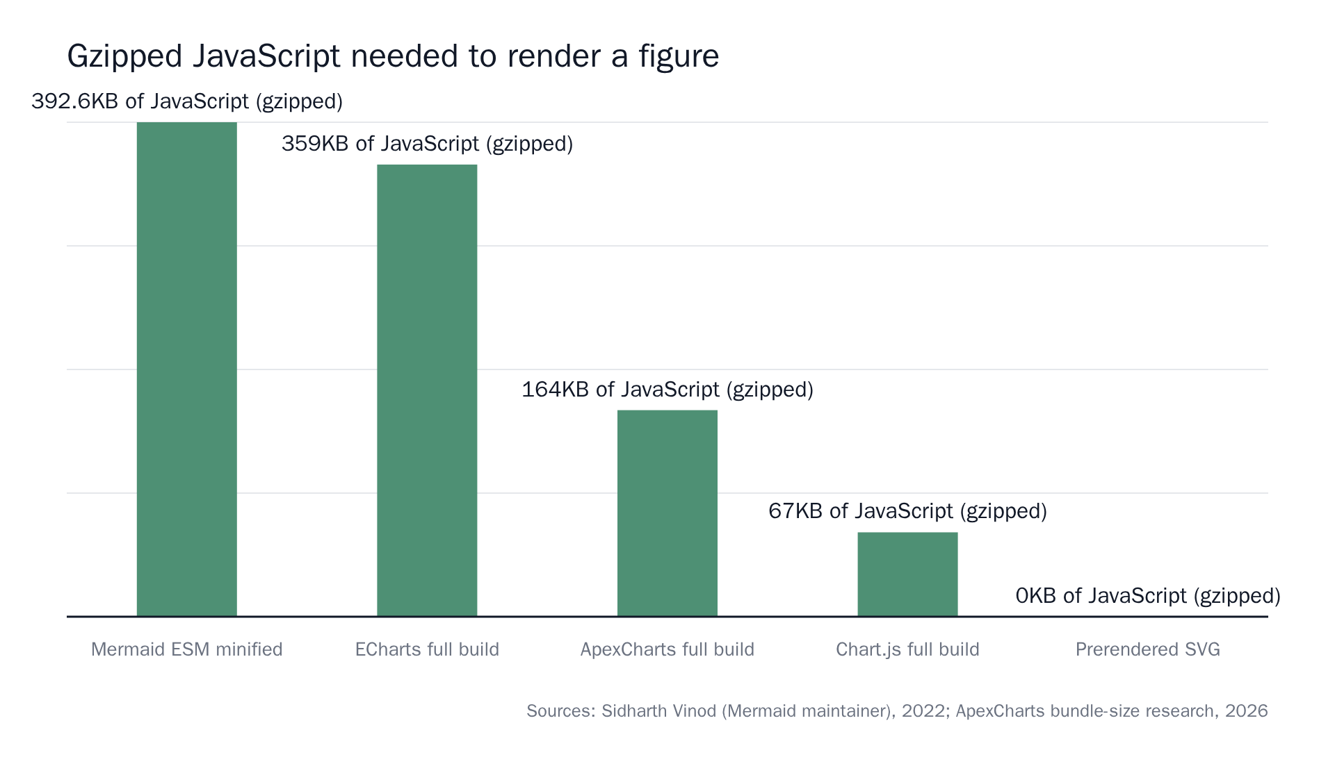 Sources: Shrinking Mermaid >30% and The State of JavaScript Charting in 2026. Mermaid's figure is published in KiB, the charting figures in KB.
The prerendered bar is zero because there's nothing to download. The SVG is in the HTML.
What build-time rendering actually costs you
It isn't free, and pretending otherwise is how people end up reverting it at 11pm.
You're putting a headless browser in CI. Builds get slower, roughly in proportion to how many diagrams you have. You inherit a cache, and cache invalidation for generated SVG is exactly as annoying as cache invalidation for anything else. Two engineers have written this up honestly: one on the build-time rendering journey with Mermaid and Next.js, one on forcing Mermaid to render server-side. Read both before you commit to it.
The trade is a slower pipeline for a faster page. On a blog, where builds happen on merge and pages get read thousands of times, that trade is obvious.
If the SVG can't name itself, screen readers see nothing
An SVG with role="img" needs a non-empty accessible name, supplied by a <title> element or aria-label. That's a W3C ACT rule, not a preference. Most chart libraries emit a bare <svg> and fail it by default, and every copy-paste tutorial inherits the failure.
Two more things while you're in there. Set explicit width and height (or a viewBox plus a CSS aspect ratio) so the figure doesn't shove the paragraph below it down half a second after paint. That's your CLS budget. And check your prerendered figures in both colour schemes before you merge. An SVG baked at build time keeps whatever palette it was rendered with, which is fine until someone flips to dark mode and gets black text on a black card.
The data belongs in the diff
This is the part that has nothing to do with rendering.
When the array lives in the MDX file or a component next to it, the number shows up in the pull request on the same line as the sentence that claims it. A reviewer can leave a comment on line 34 asking where 392.58 came from. That's a real review, the same way you'd review content the way you review code.
When the chart fetches its data at runtime, there's nothing to review. The PR diff says a component was added. The number doesn't exist yet. Nobody will ever question it, because by the time it's visible, it's already published.
Figures in files, data as literals, sources as strings. Everything else is downstream of that.
What we refuse
Contentcron generates three kinds of figure and only three: SVG charts with the source printed in the image, Mermaid diagrams, and sourced stat callouts. All rendered in the palette we pulled off your actual stylesheet. They land in the asset library alongside real screenshots of your product, tagged by feature, and get dropped into articles where they carry an argument.
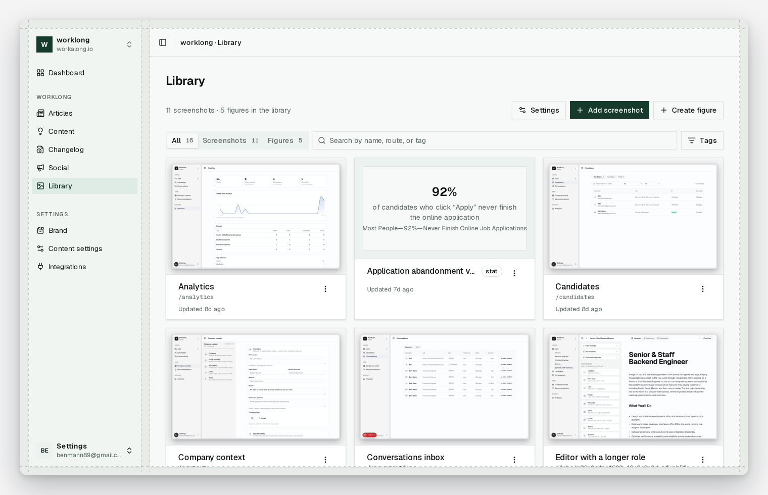
A figure that can't cite a source gets rejected. Not flagged, rejected. It returns nothing before it returns a made-up number.
And there's no AI image generation, by design. Every AI content tool I've tried will happily draw you a plausible line going up and to the right, with an axis label and a confident slope and no data underneath any of it. You can smell those the way you can smell a stock photo, and the cost of one of them showing up in your archive is every other number you've ever published.
If your posts live in a repo and your figures are currently decoration, the fix is smaller than it looks. Move the data into the file, render at build, print the source in the image, and let the reviewer argue with the number in a line comment. The first article is free, no card, if you'd rather see what that looks like as a diff.